
Introduction: In today’s digital landscape, where users access the internet through a multitude of devices with varying screen sizes and resolutions, responsive design has become essential for ensuring optimal user experience. In this comprehensive guide, we’ll explore the best practices for creating mobile-friendly websites that adapt seamlessly to different devices and screen sizes.
Understanding Responsive Design
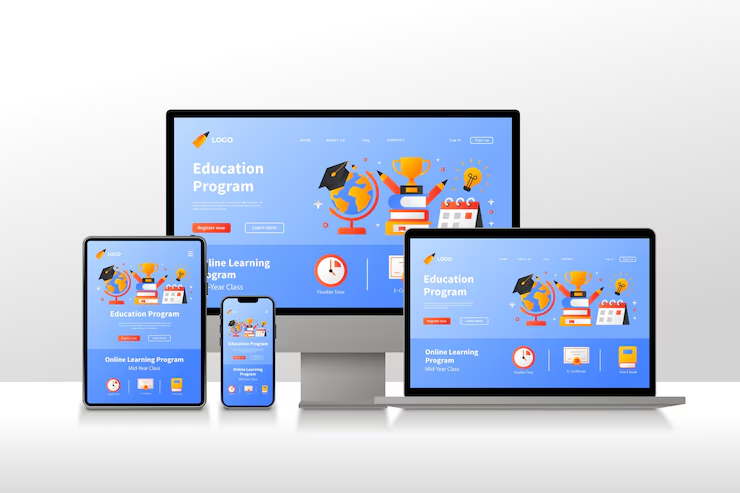
- Responsive design is a web development approach that aims to provide an optimal viewing experience across a wide range of devices, from desktop computers to smartphones and tablets. At its core, responsive design involves creating flexible layouts, fluid grids, and scalable images that adjust dynamically based on the user’s device and viewport size.
Embracing Fluid Grids and Flexible Layouts
- One of the foundational principles of responsive design is the use of fluid grids, which enable website elements to proportionally adjust their size based on the user’s screen resolution. By implementing a grid-based layout system using relative units such as percentages or ems, designers can create flexible and adaptable designs that maintain visual harmony across different devices.
Prioritizing Content and Features
- In responsive design, it’s essential to prioritize content and features based on their importance and relevance to the user’s experience. This involves adopting a mobile-first approach, where designers focus on designing for smaller screens and then progressively enhance the layout for larger devices. By prioritizing essential content and functionality, designers can ensure that users receive a streamlined experience regardless of the device they’re using.
Implementing Media Queries for Device Adaptation
- Media queries are CSS techniques that allow designers to apply styles based on the characteristics of the user’s device, such as screen size, orientation, and resolution. By using media queries to define breakpoints at which the layout should change, designers can create responsive designs that adapt seamlessly to different screen sizes. Additionally, media queries enable designers to optimize typography, images, and other design elements for specific devices and viewport sizes.
Optimizing Images and Media for Performance
- Images and media files are often the largest contributors to webpage size, which can impact loading times, especially on mobile devices with limited bandwidth. To optimize performance in responsive designs, designers should employ techniques such as using responsive images, lazy loading, and image compression. By delivering appropriately sized and optimized images based on the user’s device, designers can improve loading times and enhance the overall user experience.chniques that allow designers to apply styles based on the characteristics of the user’s device, such as screen size, orientation, and resolution. By using media queries to define breakpoints at which the layout should change, designers can create responsive designs that adapt seamlessly to different screen sizes. Additionally, media queries enable designers to optimize typography, images, and other design elements for specific devices and viewport sizes.
Testing and Iterating Across Devices
- Testing is a critical aspect of responsive design, as it allows designers to identify and address issues across different devices and screen sizes. Designers should use a combination of physical devices, emulators, and browser developer tools to test their responsive designs thoroughly. Additionally, ongoing iteration and refinement based on user feedback and analytics insights are essential for continuously improving the responsiveness and usability of a website.
Conclusion:
- Responsive design is not just a trend; it’s a fundamental aspect of modern web design that ensures websites are accessible and usable across a diverse range of devices. By following the best practices outlined in this guide, designers can create mobile-friendly websites that provide a seamless and enjoyable experience for users, regardless of the device they’re using. Embracing responsive design principles is not only beneficial for user experience but also essential for staying competitive in today’s digital landscapeners to apply styles based on the characteristics of the user’s device, such as screen size, orientation, and resolution. By using media queries to define breakpoints at which the layout should change, designers can create responsive designs that adapt seamlessly to different screen sizes. Additionally, media queries enable designers to optimize typography, images, and other design elements for specific devices and viewport sizes.